Web App for Tara, 2020
Overview
Tara is a non-profit organisation based in India that provides education, healthcare, and daycare facilities to children of migrant workers. Migrant workers often have to travel across the country with their families, which can disrupt the educational opportunities for their children. By offering daycare and educational services, Tara provides stability for these children and allows their mothers to pursue job opportunities, thereby increasing the family's income.
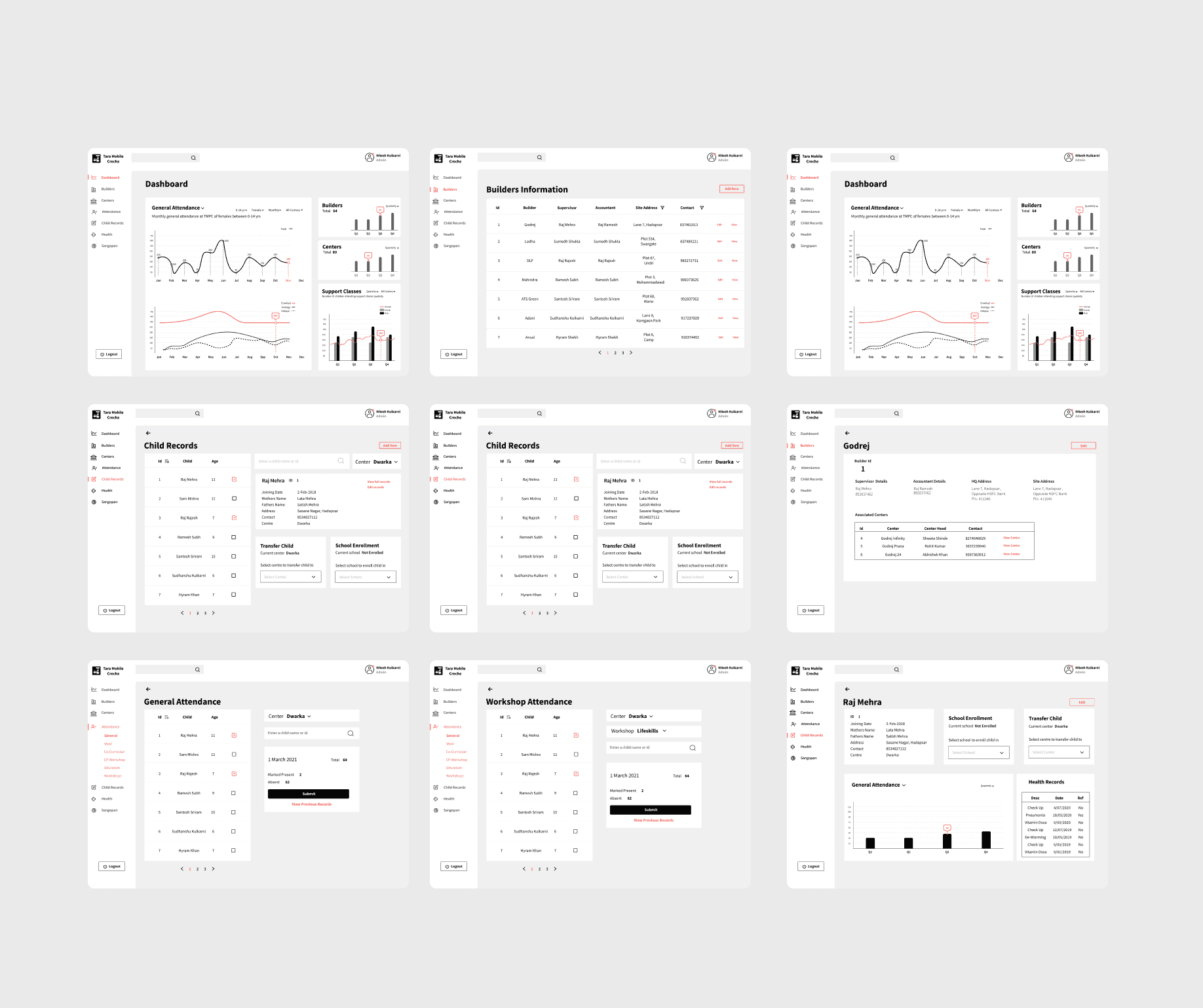
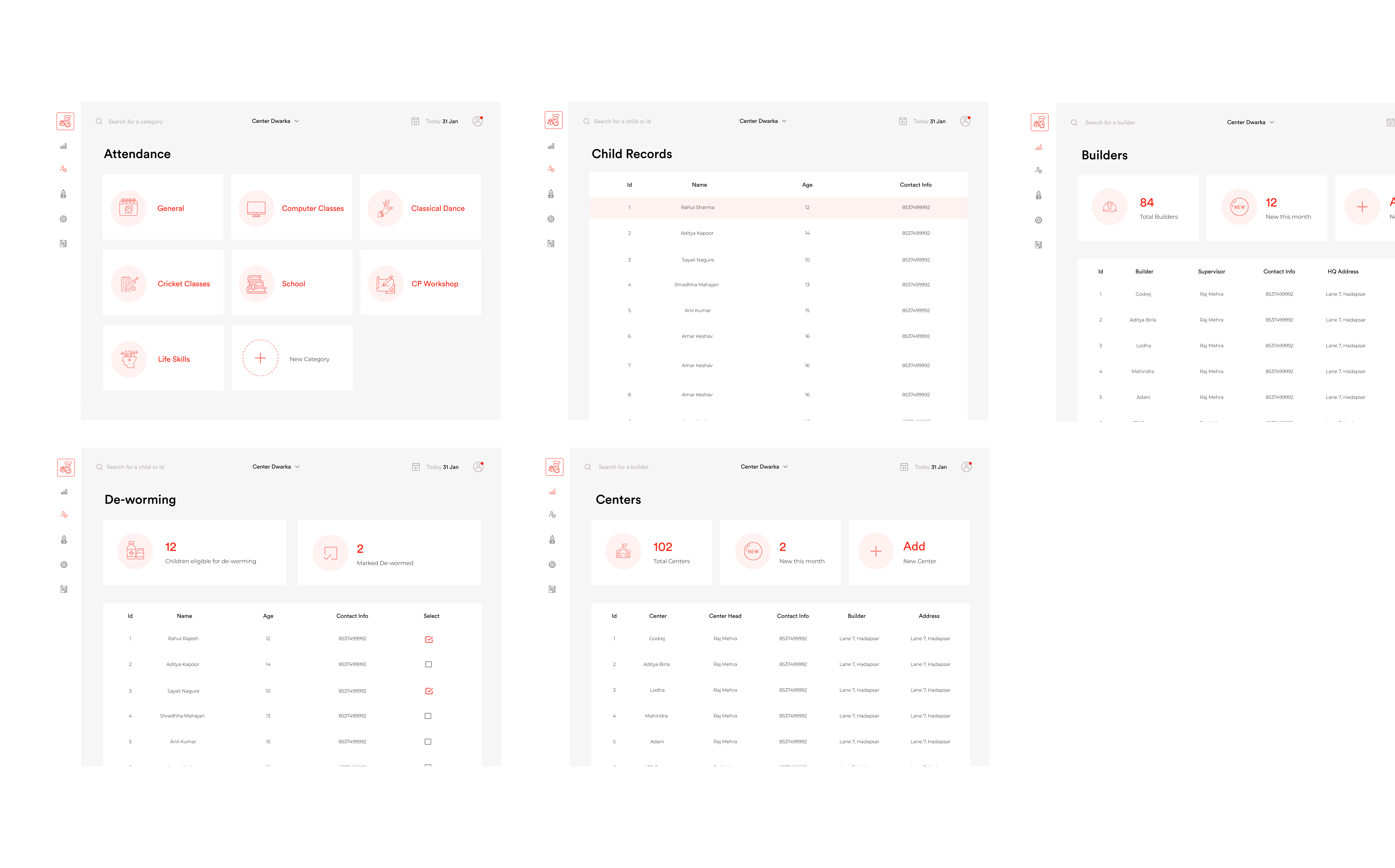
Previously, Tara stored all of its data, including accounts and children's records, in excel sheets and notebooks. Through this project, we developed a digital management system for Tara. The system consists of dashboards, analytics, and features that enable easy data updates, monitoring, and storage.
The key challenge with this project was designing for a low-literacy demographic & working around technical barriers.
Role UX Designer
Team Dev Team, Technical Manager, Stakeholders
Outcome This project went live in 2020. On an average the digital solution saves 20+ admin hours weekly, allows for data security, reduces data redundancy, helps meet government & sponsor compliances.
The Problem & Why This Matters
Storing data on paper and in excel sheets is a big problem. Previously a staff person would visit each centre in the city everyday to collect child records on attendance, class progress, health records etc. Not only is it extremely tedious & time consuming for the staff, there are bigger implications to this model
10+ Hours spend every week collecting data & updating data
Incorrect data due to manual errors, and multiple points of manual data entry before it's stored in the main excel sheet
Lack of data security
Inability to show proper fund allocation to sponsors
Difficulty meeting government compliance, which threatens the existence of the organisation.
User Research
In the research phase, we first sat down and discussed how the organisation operated. The workshops and interviews were conducted with the CEO of the organisation, the technical head & staff members. The interviews were semi-structured and aimed at gathering qualitative data on how the organisation currently functioned, what their goals were, the tech available to them & user pain points. I especially wanted to understand the ground staff's mental model to design better for them. Here are the key insights -
Despite having a laptop at each centre the staff could not make updates themselves.
The technical head needed to visit each centre everyday to collect data.
Most staff at each centre found the excel sheets too complicated.
There was no way to view live or daily data. Usually each centres data was collected and stored over the week in an excel sheet & reviewed at the end of the week.
Some centres were in low-network areas where internet connectivity was unstable.
It was difficult to track fund allocation & the progress of various initiative such as new english lessons or computer classes.
Who am I designing for?
There were three main user groups that came up through research, each of them had different goals, pain points and roles within the organisation.
Major Stakeholders & Executives - their main goals were related to tracking, monitoring data & being able to justify their financial & business decisions. Their key challenge was that it is quite difficult to do so with inaccurate & unreliable data.
Admin & Management Staff - their main goal was collecting and storing data, making sense of it & presenting to higher ups. Their biggest frustration was how time-consuming & tedious it was to manually enter data from paper that was provided to them by the ground staff.
Ground Staff - their main task was data entry. Their challenge in doing so is the technical & literacy barrier.
Designing For Low Literacy Users
Through the research phase it was evident that providing a way for the ground staff to use the tech (Laptops) available at each centre would be allow eliminating or reducing manual paper based entry. This would in-turn solve admin and management staff issues since they would no longer need to manually update data. And it would also solve the executives issues since a digital system would allow them to view live data, and they would have more reliable data. What I observed with low tech & reading literacy users was that
They did not scan web-pages or mobile apps as we would, but they really had to read text word for word.
While observing how they used their mobile phones - they were generally taught a user flow by their more tech savvy children. They would memorise these flows and only go over these user flows. If a step or error that they weren't familiar with occurred they were lost.
They have a strong tendency or likelihood to miss or skip important information.
They generally did not search for things or explore applications.
Design Direction
Prioritise information - Only show relevant and necessary information for each user group.
Simplify navigation - Very minimal steps which are easy to memorise & learn.
Streamline the page design - Simple page design & placing important information strategically.
Different for IA & Features for Different User Groups
Since the goals & user characteristics of our 3 user groups are very different, I though of having different features and information available based on the user's role in the company. For example - analytics and dashboard was not visible to ground staff or management. Data Entry was only visible to ground staff. This also helped streamline and only show relevant info for each user group.
Wires & Testing
Based on feedback from the client sponsor and usability testing on 10 users, I revisted the design. As part of the usability testing the users performed given tasks, such as updating attendance, adding a new child, creating a health report, viewing workshop attendance of a particular date etc. Here are some of the key changes
7/10 users were able to perform every task post instructions. Instructions were necessary for ground staff since they relied on memorising the tasks. But for the other two user groups instructions were not necessary. A walkthrough document was created which admin staff could use to train the users and later ground staff could train each other.
In the redesign, few components from the navigation such as log-out, transferring a child to another centre were changed. Some edge-cases were discovered and designed for.
A close current date option was added, to make sure previous records are not modified. This ensured data integrity is maintained. Since sometimes attendance was updated the next day, we provided and option to select close date instead of using system date by default.
Final Designs
Our goal with this project was to get a live solution up and running as soon as possible. Additionally the dev team also worked on this pro-bono. So I had to work around a design that was feasible at that time with our resources. That came with several restrictions in terms of what was possible in terms of visual design. I wanted to ensure things were easy to implement, I reused a lot of patterns (like tables) so coding efforts were minimised.
The Outcome
A MVP with most of the features went live in 2020. On an average the digital solution saves 20+ admin hours weekly, allows for data security, reduces data redundancy, helps meet government & sponsor compliances.
Gauri Rajmane


